The Secret of Fonts: A Grandfather’s Lesson to His Granddaughter
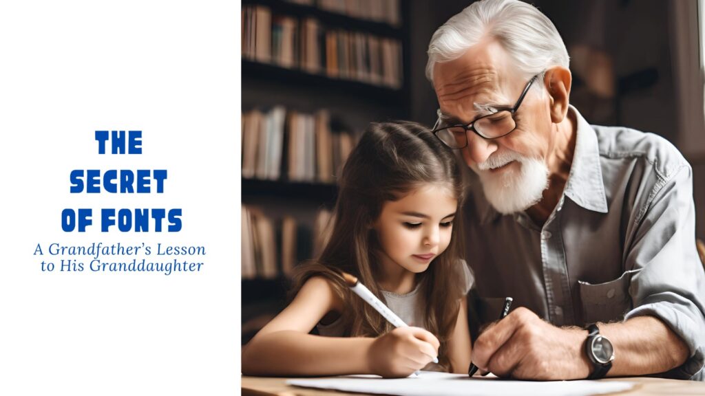
It was a quiet evening, and little Riya sat beside her grandfather, flipping through the pages of an old design book. She loved how different words looked—some bold and grand, others soft and delicate.
“Dadaji, why do some words look so serious, and others look playful?” she asked, her eyes full of curiosity.
Grandfather smiled, adjusting his glasses. “Ah, my dear, that’s the magic of fonts! Choosing the right font is like picking the perfect outfit—it tells people who you are before you even speak.”
1. The Personality of Fonts
“Just like people have personalities, fonts do too,” Grandfather explained. “Some fonts are elegant and formal, while others are casual and fun. Let me introduce you to three font families.”
📌 Serif Fonts (The Wise Grandparents)
“These fonts have tiny feet, called ‘serifs,’ at the ends of letters. They look traditional, trustworthy, and are often used in books and newspapers.”
💡 Examples: Times New Roman, Garamond, Georgia
🎯 Best For: Print media, formal documents, elegant branding
📌 Sans-serif Fonts (The Modern Thinkers)
“These are clean and simple—no extra strokes. They feel fresh and modern, just like young minds full of new ideas.”
💡 Examples: Arial, Helvetica, Poppins
🎯 Best For: Websites, tech brands, minimalist designs
📌 Script & Decorative Fonts (The Artists)
“These are playful and stylish, like a painter’s brush or a calligrapher’s pen. They bring creativity but should be used sparingly.”
💡 Examples: Pacifico, Lobster, Brush Script
🎯 Best For: Invitations, logos, special headlines
Riya giggled. “So, picking the wrong font is like wearing pajamas to a wedding?”
Grandfather chuckled. “Exactly! A serious business report in Comic Sans would look silly, wouldn’t it?”
2. The Perfect Font Size – Not Too Big, Not Too Small
“Fonts also need the right size, just like clothes. If it’s too big, it shouts. Too small, and no one notices.”
He picked up a newspaper and pointed at the different text sizes.
🟢 Headings (Big & Bold – 24-32px)
“The headline is like a drumroll—it grabs attention. It should be large and bold.”
📌 Example:
📰 Big News Today! (28px, Bold)
🟡 Subheadings (Medium – 18-22px)
“Subheadings help organize information. They’re like the friendly guide in a museum.”
📌 Example:
💡 How This News Affects You (20px, Medium)
🔵 Body Text (Small & Readable – 12-16px)
“This is the real storytelling part. It should be easy on the eyes, not too tiny, not too big.”
📌 Example:
📖 “The new policy will help students get better access to learning resources.” (16px, Regular)
3. Font Positioning – Where to Place What?
“Even the best font looks bad in the wrong place,” Grandfather warned.
📌 Left Alignment (Best for Reading)
“Most books and websites align text to the left. It makes reading easy.”
📌 Center Alignment (For Special Messages)
“Great for invitations, posters, or poetry—when you want something to stand out.”
📌 Right Alignment (Rare, but Stylish)
“Used in artistic designs, but not ideal for long reading.”
Riya nodded. “So, if I make a school poster, I should keep the title big, the subheading medium, and the details small but readable?”
Grandfather smiled. “You’ve got it, my little designer!”
4. The Final Rule – Readability is Everything
“Never pick a font just because it looks fancy. If people struggle to read it, the message is lost.”
✔️ Good Font Choice: Easy to read, fits the brand, looks professional
❌ Bad Font Choice: Too fancy, too small, hard to read
The Grandfather’s Golden Tip
Before bedtime, Grandfather gave Riya one last piece of advice:
📌 Choose a maximum of 2-3 fonts in one design. Too many fonts make a mess.
📌 Use bold & italics wisely. Only highlight important words.
📌 Test your design. If someone finds it hard to read, change it!
Riya hugged him tight. “Dadaji, I’ll always remember—fonts are the clothes of words!”
Grandfather smiled. “And now, my little designer, go create something wonderful.”
🎨 Do you want more design secrets? Follow me for expert tips on advertising, copywriting, and creativity!
Заказать диплом любого института!
Приобретение документа о высшем образовании через надежную фирму дарит немало преимуществ для покупателя. Быстро и просто приобрести диплом любого института у проверенной организации: doks-v-gorode-novokuznetsk-42.ru
Your comment is awaiting moderation.